PHOTOCIRCLE REDESIGN
A mobile redesign to improve PhotoCircle’s album collection, organization, and user-to-user interaction.
Jan 2025 – May 2025
UX Designer
Figma, FigJ,
Leads: Nathan, Sarah
Designers: JunHa, Sophia, Diana
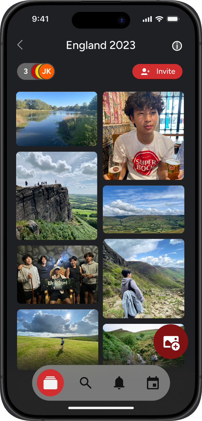
PhotoCircle is a media-sharing platform for families, friends, and businesses to easily share photos and videos. The app’s goal is to streamline the photo-sharing process through “circles”, which allow users to create private, collaborative albums and add members through a shareable link.
While PhotoCircle has limited functionality that fulfills its purpose, the app could benefit from additional features that broaden its use and make it easier to organize photo albums.

PhotoCircle could focus on improving organization, simplifying the process of reviewing large albums, and integrating social sharing and photo management options.

We analyzed popular photo-sharing apps to see what features they offered and where they fell short. Most focused on photo storage and organization but lacked community and collaboration features. This helped us find opportunities for PhotoCircle to stand out by making sharing easier, more social, and more enjoyable.


To better understand our target audience, we conducted interviews and secondary research to uncover users’ photo-sharing habits, preferences, and frustrations. Our main user group consisted of 10 college students who frequently collect and share photos on social media, balance busy schedules, and are transitioning into adulthood with new responsibilities.
We split our interviews into two parts:
Since we weren’t able to interview many current PhotoCircle users, we also conducted secondary research by looking at the app’s reviews on the App Store. Here’s what we found:
Users appreciate the app’s simplicity. One reviewer mentioned, “Was invited to join and use PhotoCircle and am happy I did. It’s so easy to use, share pics, and post comments with a group of friends.”
Some users express frustration with the frequency and placement of ads in the free version, describing them as “intrusive” and “inconvenient.”
There are mentions of delays in photo processing and uploading, with one user commenting, “2 weeks later and still the remaining 3/4 of the photos are ‘processing’ or ‘loading’.”
But why was this the case?
Users tend to share photos with their private circles to interact with close friends and family.
Users primarily use PhotoCircle to share personal moments with close friends or family, valuing privacy and small-group interaction over public sharing.
Many users felt overwhelmed by the large number of photos they collect, leading to disorganization and neglected albums. Simplifying the process of managing and viewing photos became a clear need.
Users find the amount of photos collected to be overwhelming, which leads them to leave their photos unmanaged.
Users appreciate search and organization methods to find specific photos, although not all users utilize albums and folders.
Users appreciated having search and sorting options but found them limited or inconsistent. Improving organization tools could make it easier to find specific memories quickly.
We explored how people share and organize their photos to see what makes the experience fun or frustrating. Using this, we created personas and journey maps that showed common pain points, moments of confusion, and how PhotoCircle could make sharing memories easier and enjoyable.
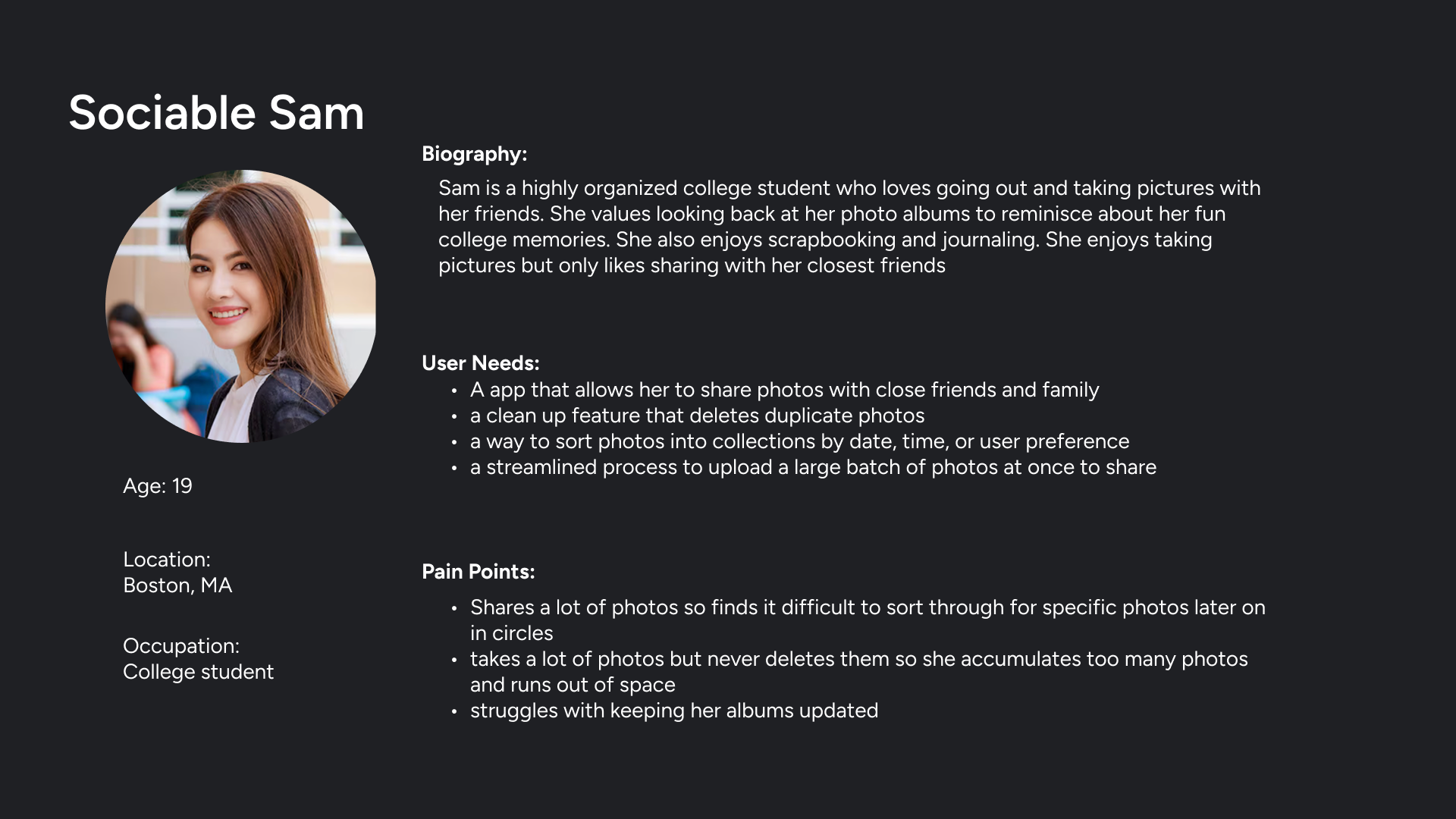
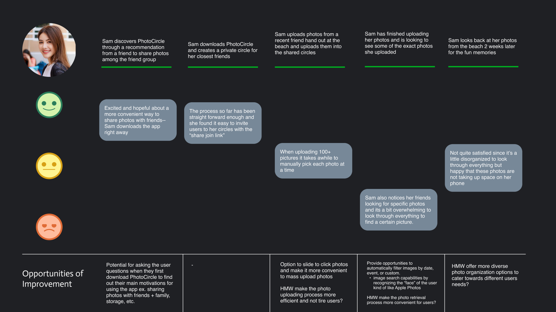
Sociable Sam loves taking photos with friends and sharing them privately. She enjoys reliving memories but struggles to keep her albums organized. PhotoCircle helps her stay connected while keeping photo sharing simple and clutter-free.
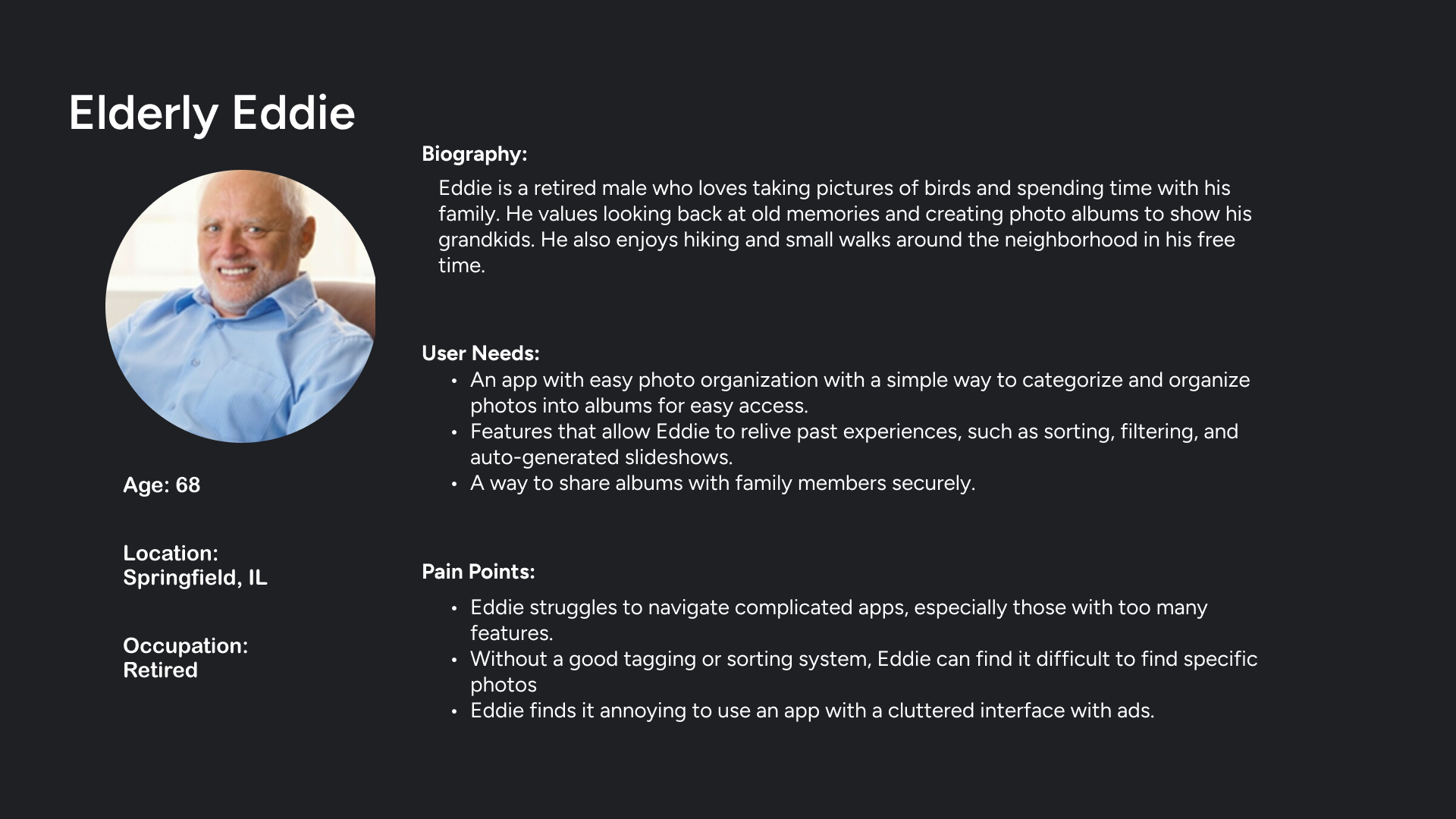
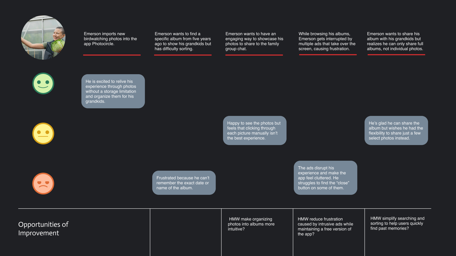
Elderly Eddie loves taking photos of nature and family moments but struggles with apps that feel cluttered or confusing. He wants a simple way to organize and share photos with his grandkids. PhotoCircle helps him relive memories easily with clear navigation and effortless album organization.
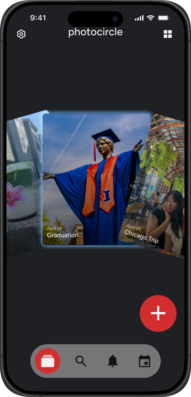
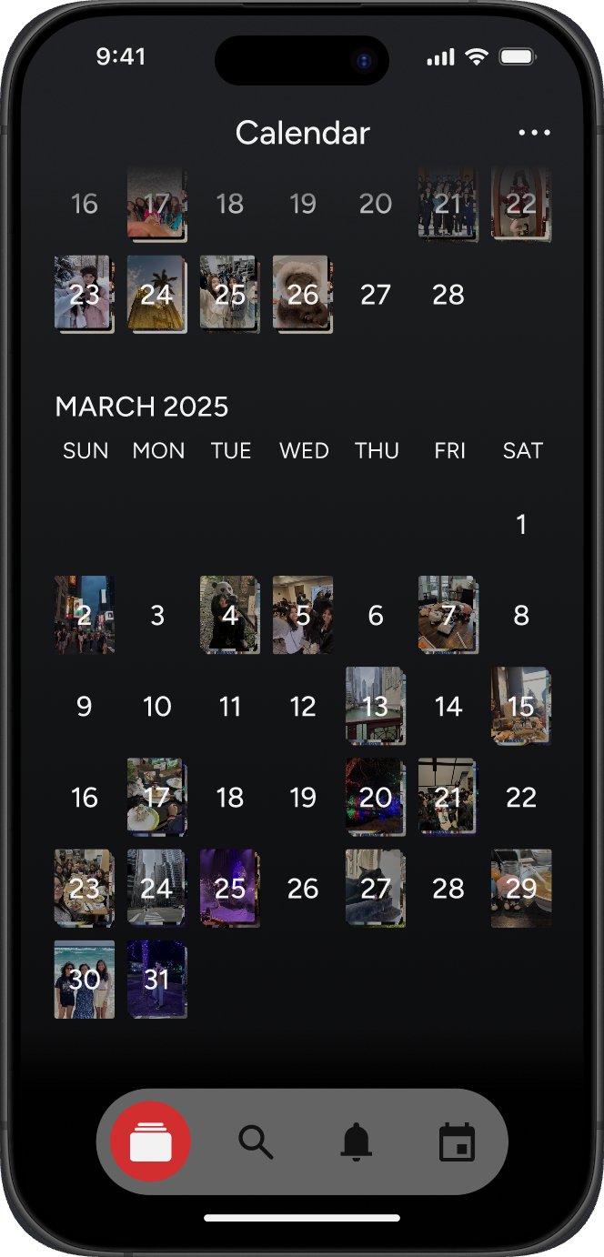
Our app is organized into five main tabs—Home, Search, Create Circle, Calendar, and Activity Feed. Each was redesigned to make navigation easier and photo sharing more intuitive. We refined old flows and added new features, like filters and invitation cards, to help users organize and connect within circles more smoothly.
We chose Figtree as our primary typeface for its clean, modern look and great readability across screens. Its rounded shapes and balanced proportions give the app a friendly yet professional feel.
For our color palette, we kept PhotoCircle’s original identity but refined it with a few new tones—Redeye, Dark Red, Baby Blue, and Charcoal—to add more contrast and hierarchy. This palette helps create a consistent visual language that feels warm, clear, and easy to navigate.
After developing our new information architecture, we began sketching ideas for each main tab—Home, Search, Create Circle, Calendar, and Activity Feed. Each teammate focused on one section of the app, exploring ways to make sharing and organization more intuitive.
I focused on early concepts for the Circles and Invitation pages, sketching layouts that improved how users create, name, and manage their circles. Our sketches helped visualize smoother flows and identify new opportunities for clearer navigation and collaboration.
{{ sketchCaption }}
With our sketches complete, we moved on to creating low-fidelity wireframes to visualize how our redesigned features would function together. We built wireframes for each main tab—Home, Search, Create Circle, Calendar, and Activity Feed—focusing on improving flow and usability.
I focused on the Circle Creation flow, exploring ways to make it easier for users to name, organize, and invite others to their circles. My wireframes emphasized a smoother setup process and clearer steps for collaboration, helping lay the groundwork for the high-fidelity prototype.
After finalizing our wireframes, we created high-fidelity prototypes to bring our ideas into a realistic, interactive form. I focused on refining the Circle Creation flow, using consistent colors, typography, and spacing from our design system to create a cleaner and more intuitive experience. The prototype showcased how users could easily name circles, select photos, and send invitations—all within a simplified, visually cohesive layout that made sharing feel effortless.
- {{ p.text }}
This project was my first full UX redesign, and also my first time focusing heavily on user research to guide every design decision. I learned how to approach an existing product with a critical eye, understanding what already works while identifying areas that could be improved. Conducting interviews, analyzing user feedback, and forming insights helped me connect design choices directly to real user needs.
We also had the opportunity to collaborate with students from HIDC and UNIST in Korea, comparing our research methods and design processes. Seeing how other teams approached similar challenges gave me new perspectives on user-centered design and showed how cultural context can influence both user behavior and design priorities.
Through multiple rounds of feedback and prototyping, I became more comfortable refining layouts, improving usability, and using Figma’s tools to create cleaner, more functional designs. Working closely with my teammates also strengthened my communication and collaboration skills. Overall, this project helped me grow as a designer by teaching me how thoughtful research and teamwork can turn a simple redesign into a meaningful user experience.